Path: Workspace Homepage >> Navigation Panel >> Reporting
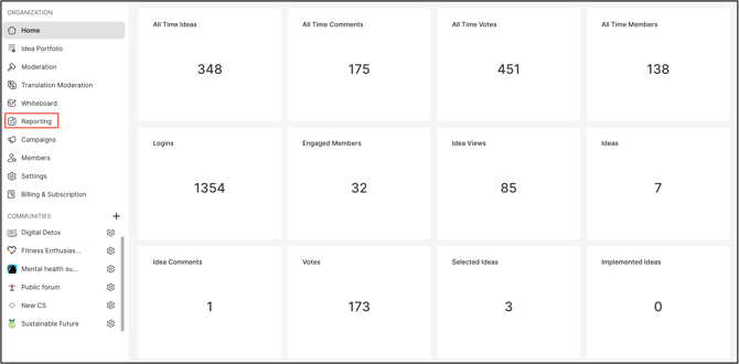
The Reporting dashboard is an essential tool for administrators and moderators of both the workspace and the community. It provides an at-a-glance overview of user engagement and the overall performance of the workspace and community. With the new reporting dashboard, you have the flexibility to create a customized view by adding the elements that matter most to you, allowing for timely and relevant insights.
Reporting mainly consists of two major sections:
1. Dashboard : The dashboard enables users to track multiple reports at a glance to gain a better overview of their IdeaScale Data. To enable dynamic data visualization, users can add multiple reports to a custom dashboard. The dashboard will launch with multiple pre-made reports and dashboards so users can easily understand how these function. 
Help Article on Dashboards
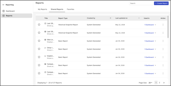
2. Reports: The Report tool allows admins to build completely custom reports from dozens of datasets available in IdeaScale. Admins are able to customize the data they are tracking, input a custom timeframe, and visualize their data with multiple easy to read report types.
Each report is build out of the following components:
- Report Type
- Data Category
- Time Frame
- X axis
- Y axis