Community Infographic
Path: Profile Dropdown >> Reporting & Analysis >> Community Infographic
The community Infographic provides a big picture overview of your community or campaign for a specified time frame.
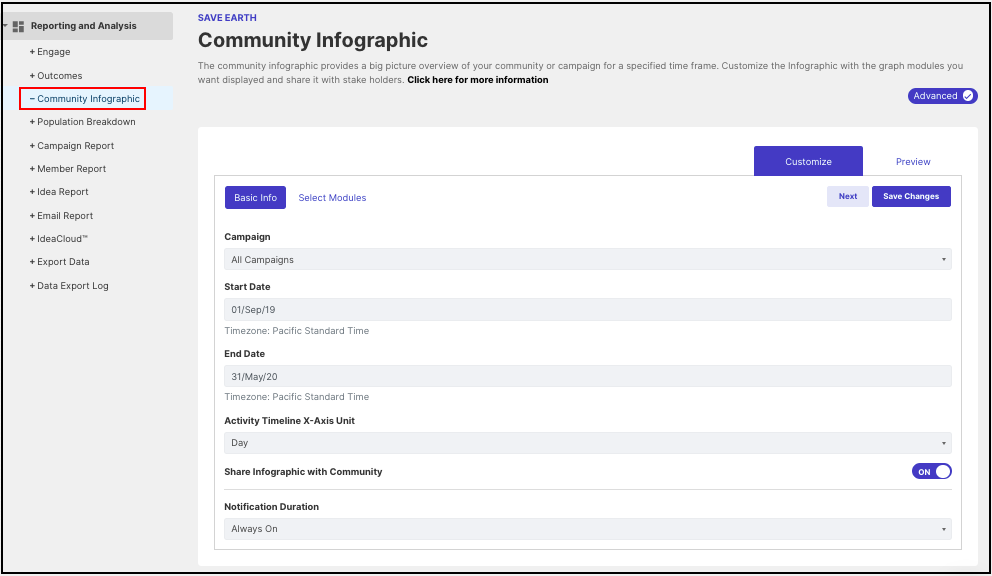
Community administrators can customize the Infographic report with the graph modules and easily share it with the community members.
1. Enter the Basic Information
-
Campaign: Choose all campaigns or a particular campaign whose infographic data is to be displayed in the report
-
Start Date: Select a start date so that infographic data can be generated from the specified date.
-
End Date: Select an end date so that infographic data can be generated till the specified date.
-
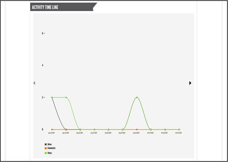
Activity Timeline X-Axis Unit: This field allows the administrator to choose the x-axis unit for the activity timeline, making it flexible to plot graphs depending upon the time interval selected. The x-axis unit can be Day, Week, Month, or Year.
-
Share the infographic with Community - Set the switch ON if all the members of the community are to be allowed to view the infographic report.
-
Notification Duration: Notification Duration is a time frame for a published infographic report to remain as a notification alert in top bar section beside your profile name (refer last screenshot of this help article). Notification Duration can be always visible, one day, two days, three days, one week, two weeks or never notify.
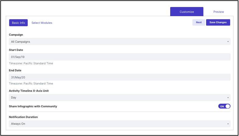
Once the basic information is filled, click on the "Next" button in the top right corner and proceed to Select Modules.
2. Select Modules
Enable or disable infographic modules that you would like to display in the report. It is also possible to simply drag and drop modules to organize the report. Once set, click Save changes.
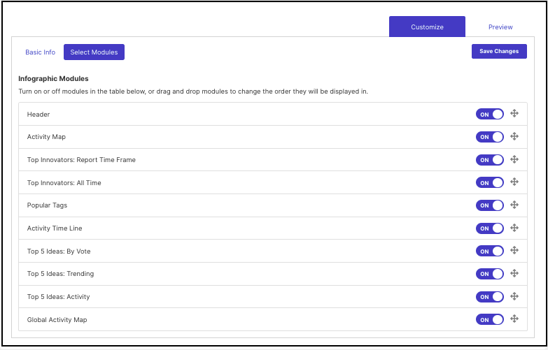
Click on Preview in the top right corner to view the infographic report. This report can be published within a community and is available in printable format.
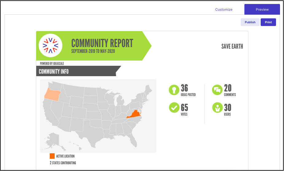
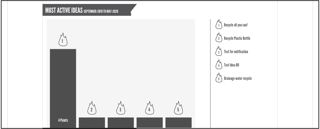
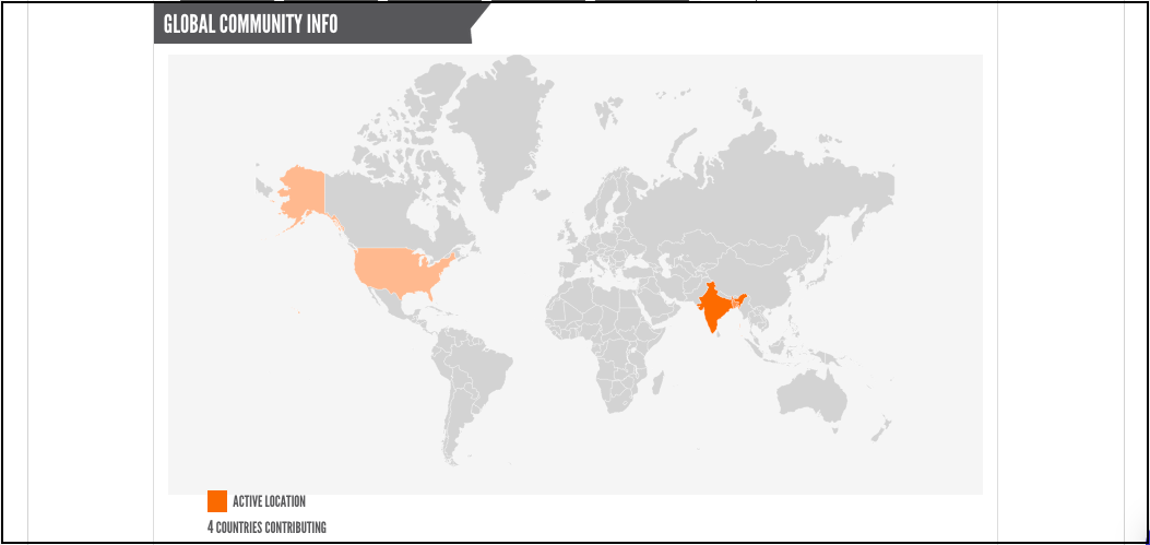
Note: It shows the number of ideas, comments and votes submitted along with the users who registered to the community during the selected time period.
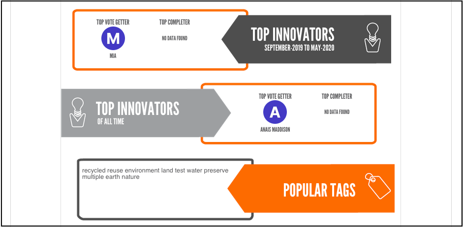
For Top Completer:
1. When infographic is generated for All Campaigns community :- is the member who has the maximum number of ideas reaching the last stage of the default funnel or the funnel first, associated with authorized campaign.
2. When infographic is generated for single campaign - is the member who has the max number of ideas reached in the last stage of the campaign funnel.
3. When the funnel has one stage and many ideas - If there are multiple members with the same number of ideas, then it considers the max number of ideas a member submitted and then the member who registered first.
Reserve stage is considered in it as well.
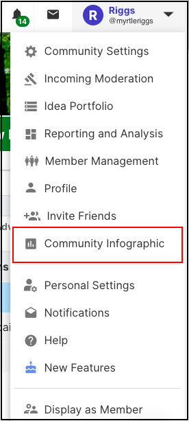
Community members need to click on Community Infographic from the user dropdown to view the published report. A screenshot is added below.
Note: Community members won't get any notification for the Community Infographic report. It's by design.