How to leverage community colors in your landing page
Path: Community Topbar >> Apps Icon >> Community Settings >> Customization >> Look & Feel >> Community Colors
Workspace colors set at the Workspace level as default for all communities under the workspace can be customized for individual communities from the Community colors. These appears only on the Community Landing page.
Labels appearing beside the settings are:
- Inherited from Workspace: Indicates the setting is taken from the workspace defaults and not customized at the community level.
- Reset to Workspace Default: Allows reverting the setting back to the inherited workspace value, removing the community-specific customization.

Let's see how these colors appear on the various templates of Community's Landing page!
Armstrong template
- The background color in the first module is the Community Color >> Highlight
- The background color in the second module is the Community Color >> Colors accent 1

Berners-Lee template
1. Community Color >> Highlight color reflects on the edge of the right-hand side of the first module's image. For example, the brown color below.
2. Community stats are a mix of all the colors (Community color >> Highlight, accent1, accent2)

3. In the ‘How it works' section the numbering and photos shadow is the Community color >> Highlight color

4. In the 'Let's build better product together' section, the photo's shadow is the Community color >> Highlight color.

Curie template
This template doesn't show any changes.Eastman template
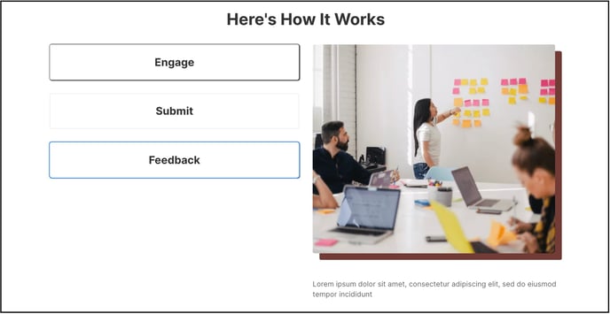
In the ‘Here's How it works' section, shadow part on right hand side of image is the Community Color >> Highlight color. For example, brown color is set as highlight color in the below image